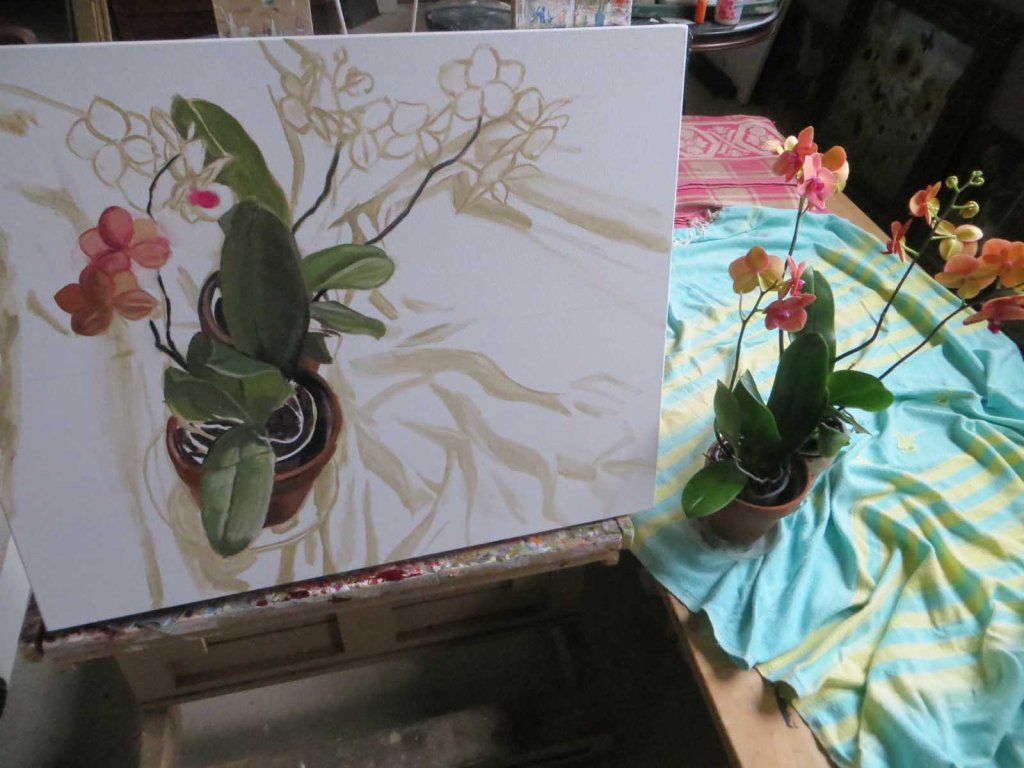
Years ago when I took a lot of art workshops out west, I loved to visit the galleries to see what people were doing. Believe me, artwork in Midwest galleries looks quite different from artwork in galleries out West. I noticed that the paintings that had the most “pop”, that seemed to jump off the wall were ones done in contrasting colors: lots of reds paired with greens, oranges paired with blue, and so on. Ever since then I lean towards using lots of contrasting colors. In this case, the orchids were in rich, deep, peachy-rust tones. So I rummaged around in the back room and dug up a cloth in pale turquoise. When I threw it on the table, it fell in a wonderful, mussed-up pile. I love twists and turns! Actually, the folds in the fabric were the first things I started with, using a pale, thin color to “draw” them in. I used some Liquin in the paint, so hopefully my wrinkles will be dry enough tomorrow to start painting in the actual colors.
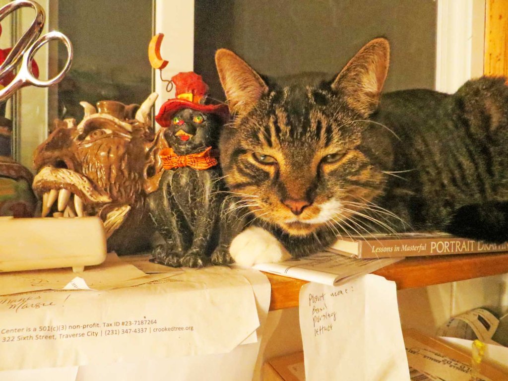
And I will have to keep an eye on my cats. They sometimes have the urge to rearrange my setups. They love to lay on things I’m working on. Can’t you just see the devilment in Mr. Wonderful’s eyes?
It’s a good time to start a new still life. The chilly, wet weather has returned. And I need a rest from yardwork.